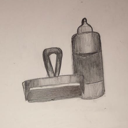
Value Drawings
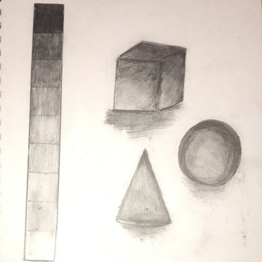
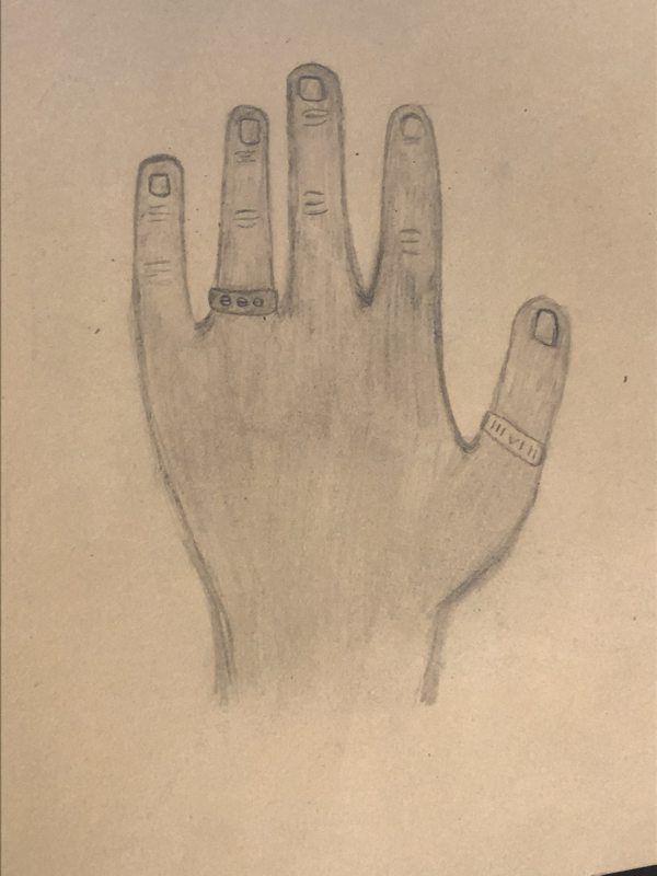
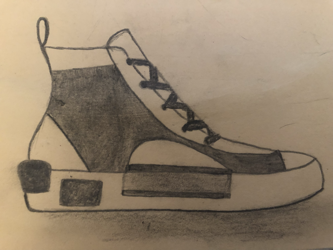
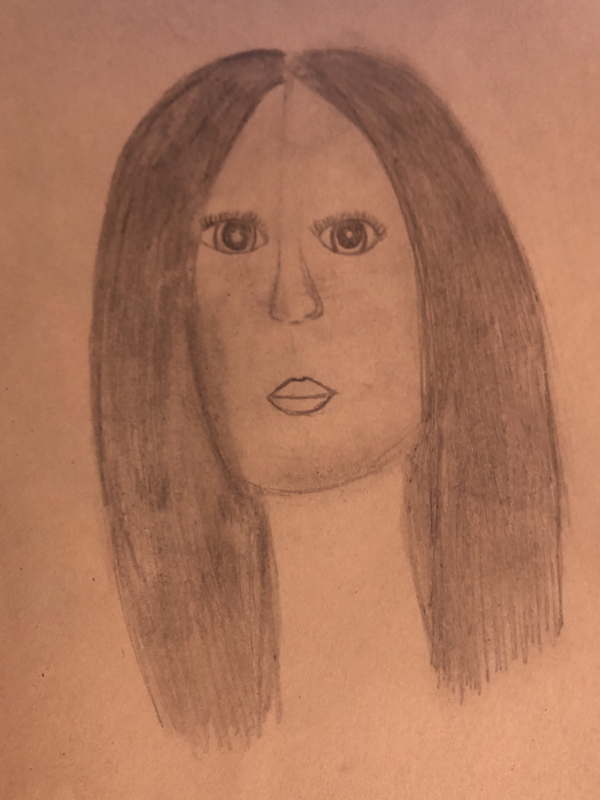
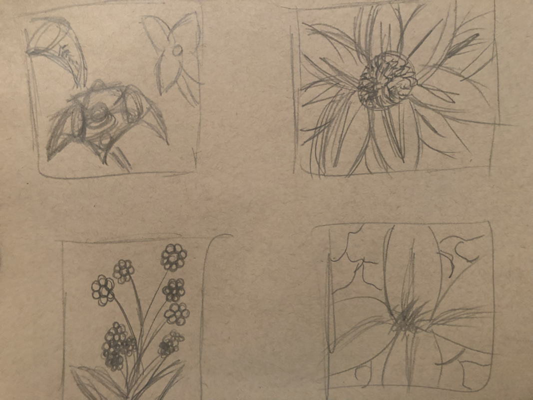
Four Assessment Drawings
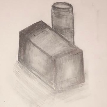
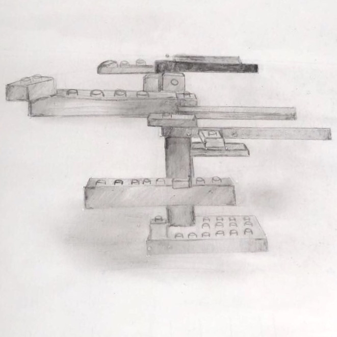
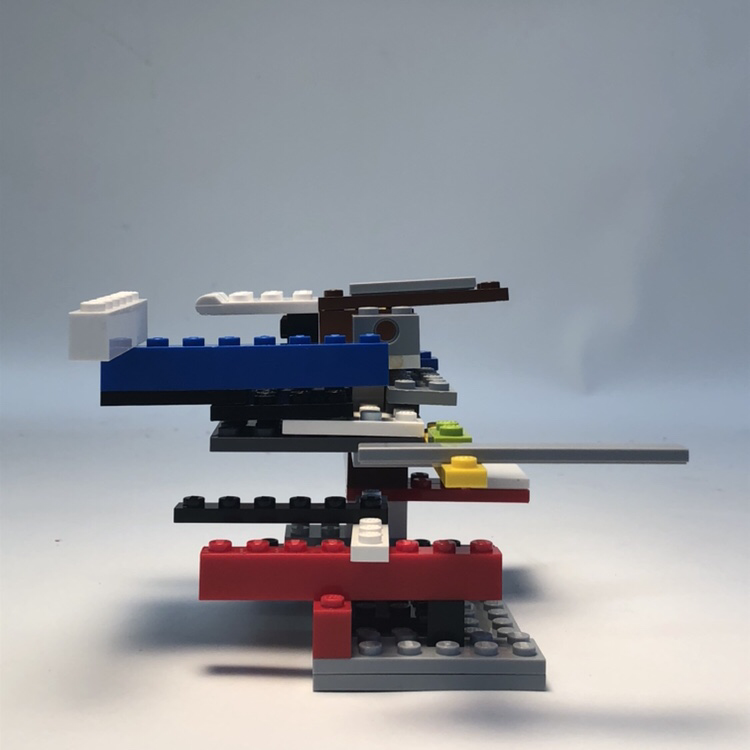
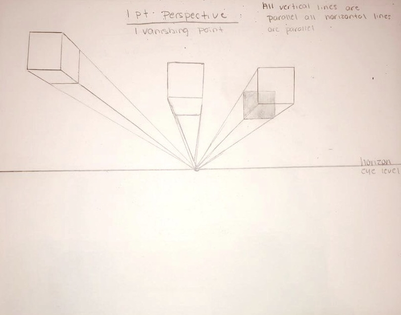
Perspective Lego Drawing
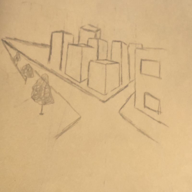
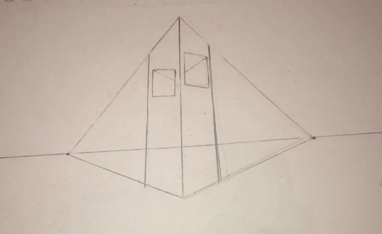
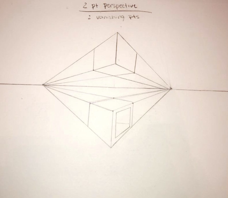
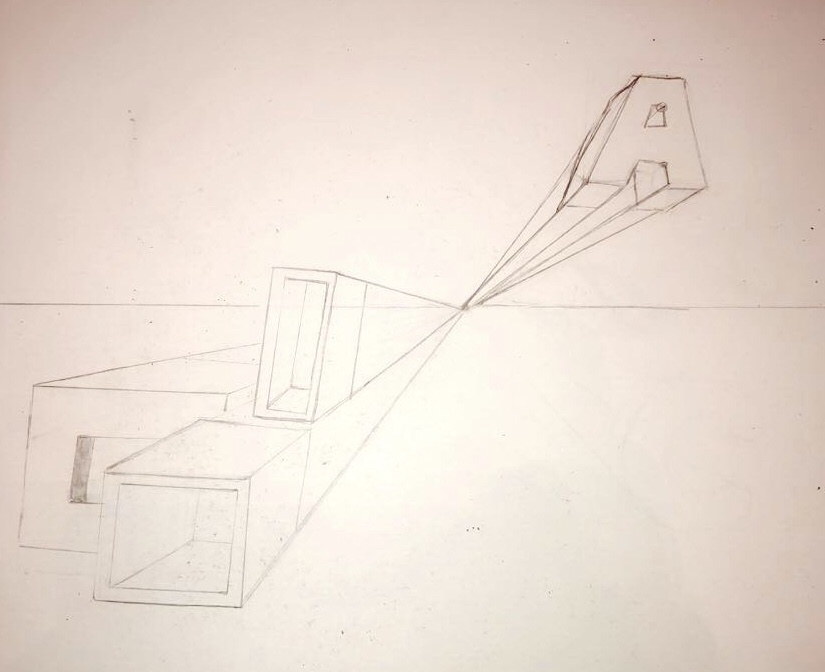
Perspective Practices
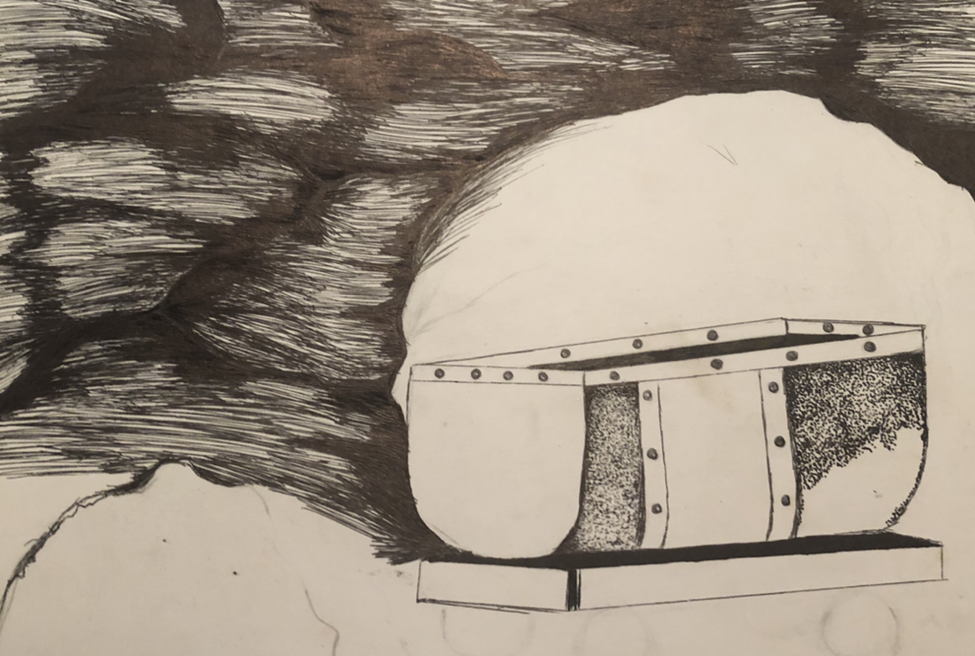
Pen & Ink Project
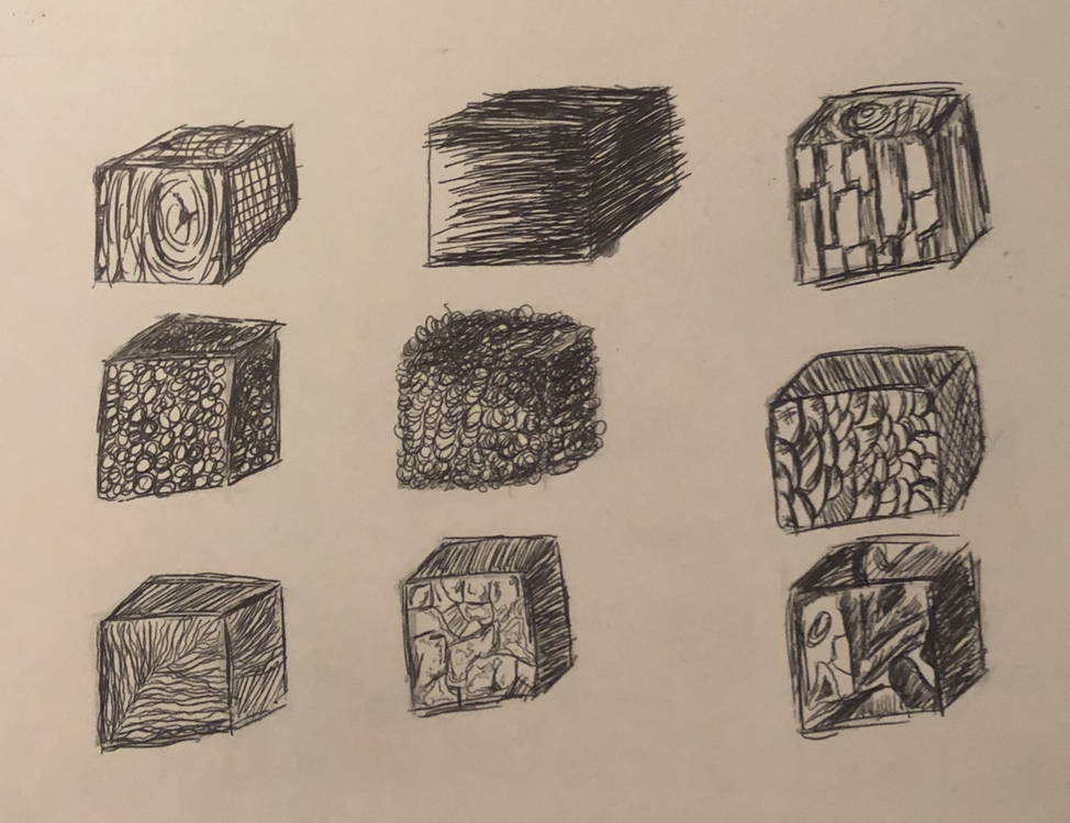
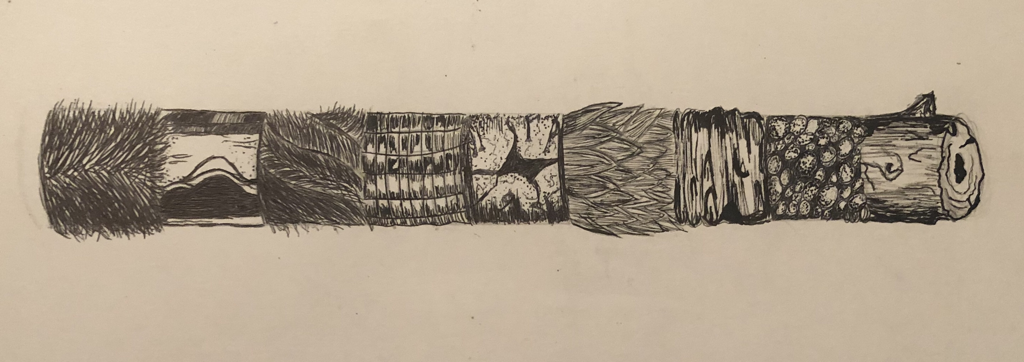
Creating Realistic Textures pt 2


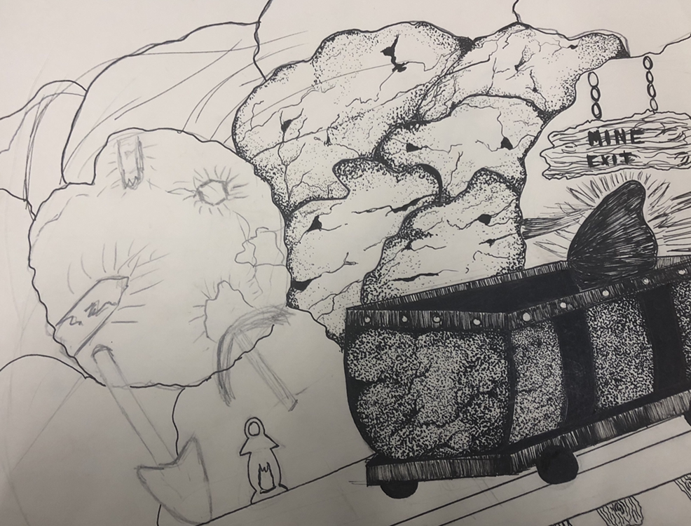
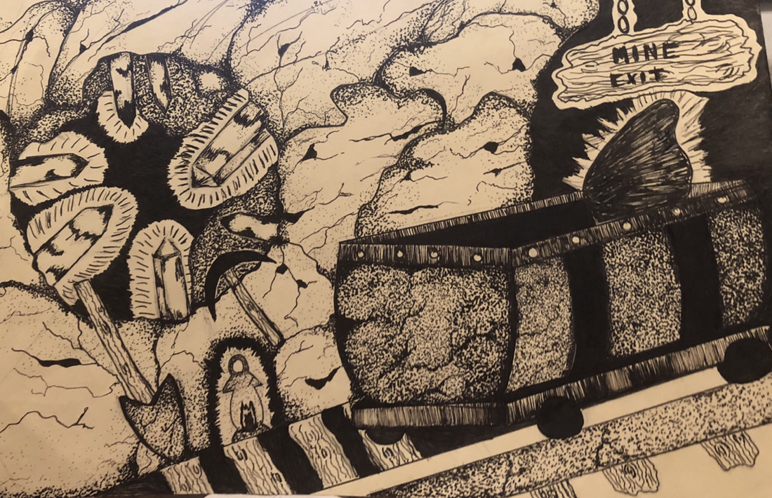
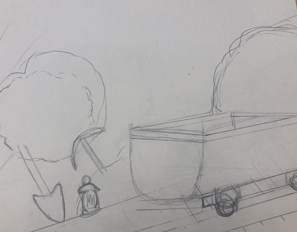
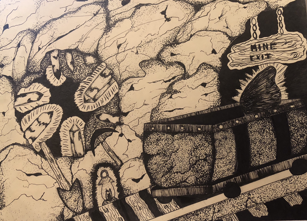 Mine Cart Final Project
Self Evaluation
Discuss your decision on pen and ink techniques. Why you chose to use one or more. (If you used stippling in certain areas explain why you chose this technique. Explain for all other techniques used).
For my techniques I mostly used stippling, I thought it best depicted the texture for the rock wall. as well as the rust on the mine cart and tracks. I also used various points on my pens, ranging from 0.5-0.1. This really helped with shadows and highlights, the closer the dots were the darker the area was. However I also added in some line techniques for the wood elements in the scene such as the sign and wooden planks for the cart.
How did you use perspective? Why is perspective important?
I used perspective in the cart , coming in from off the right side of the page. It made it look like the cart was moving fast down the tracts into the mine and really set the scene. Perspective is important because it makes the scene look more realistic, it also marks where the eye should be drawn and focused on in the artwork itself.
How is texture important in your composition?
Texture is important because it makes the picture look more realistic and it adds detail to the objects. It also makes you visualize what the object might feel like in real life.
Why is value so important in this project?
Value is important in this project because when using pen, its a great tool to show where the light is coming from and how it hits the objects.
Describe your craftsmanship (How well the project is crafted technically)
I used a lot of stippling for most of my technique. I also made most of my dots different sizes and shapes for inconsistency this contributed to the value aspect of the drawing. I think I used most of the techniques in the correct way.
If you could recreate your piece what would you do differently to enhance your final outcome?
I would've liked to add more darkness in the the rocks. Also would've liked to put the seven dwarfs hats along the bottom of the page as if the were marching on by. It would've added more elements to the piece and it also make it more obvious it was the Snow White Fairy Tale.
(Only answer if you did fairy tale) Which Fairy tale or Fable did you create? How did you represent the story in your own way?
I chose Snow White. I picked the mine scene by showing the cart rushing down into the mine. I represented this in my own way by creating a hidden hole that contains the gems, while in the move they are scattered all over. Instead of drawing all seven of the dwarfs piled into the cart, I chose to just to Dopey's hat pocking out from the mine cart as if he was sneaking down there without the others to cause mischief.
When applying the pen and ink techniques why and how is it important to make sure you understand the concepts taught in class?
It is important because these techniques can not only be used with pen, but with many other art mediums as well.
As a growing artist how do you think what you have learned will guide and better your future projects.
In future art pieces I will remember to incorporate the technique we learned in class, to create more realistic and detailed pieces.
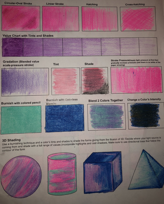
Colored Pencils Unit
Ice Cream Colored Pencil Project
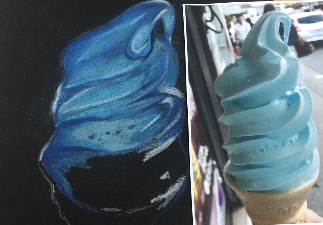
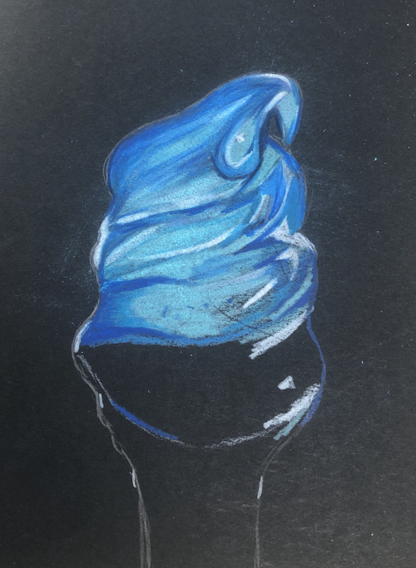
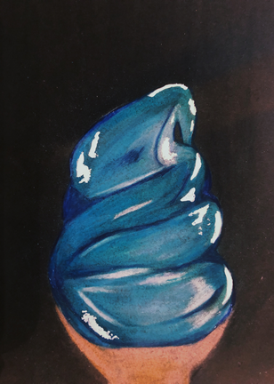
For this mini project I chose to do the blue ice cream. Fun fact I am actually colorblind, but one color I can see really well is the color blue. I experimented with different shades of blues, darker shades for the shadows and lighter shades for the highlights. I added the white to create a glossy wet look. If I could change one thing I would choose more lighter shades of blue to match the reference a tad bit better. I would also use more yellows then tans for the cone. I really like the way it turned out, I hope to continue to practice with more Prisma Color and improve. However I think this is already a big improvement from my last colored pencil project I did in art 1.
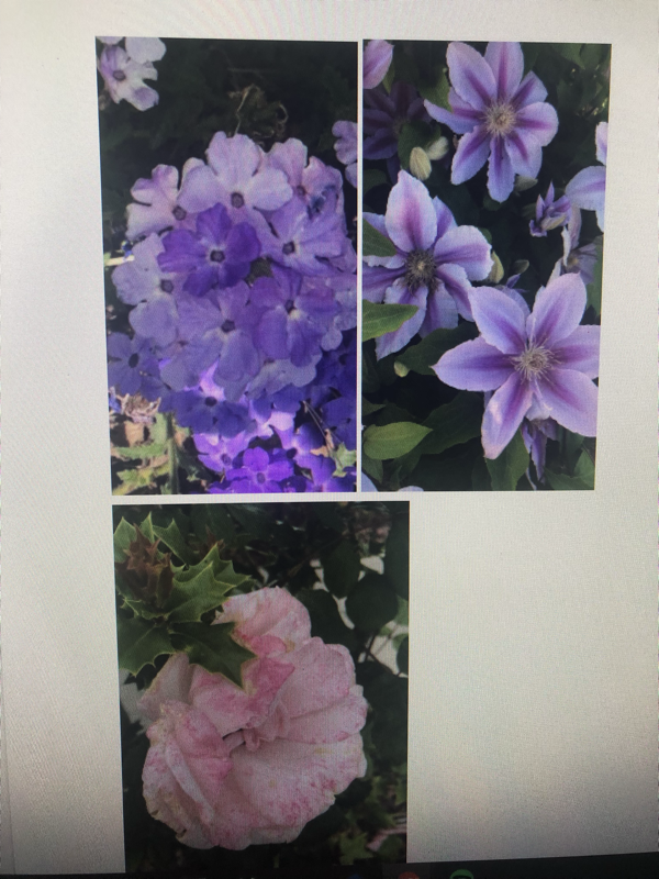
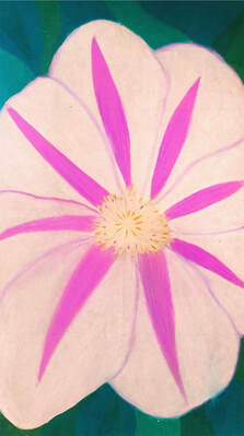
Georgia O’Keeffe Inspired Drawing
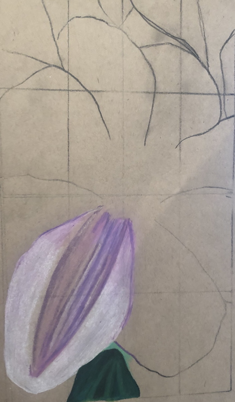
Describe the craftsmanship of your drawing. (Is it neat and well executed?)
I feel my drawing wasn't the best, its more abstract then realistic. I feel that I could've paid more attention to technique and added more detail.
Do you think you used a full range of values to create the illusion of depth?
I feel that I used value correctly from the center of the flower, but I could've added more depth in the petals.
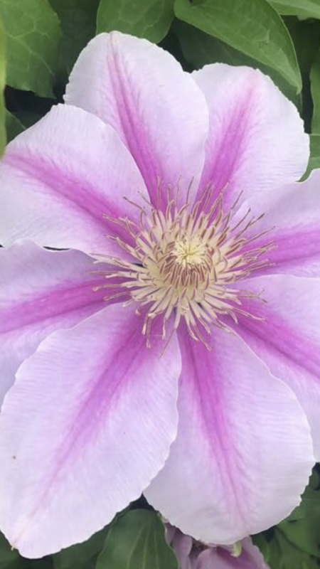
How do you think you represented the style of the artist Georgia O’ Keeffe?
By drawing the flower a little more abstract with burst of color and zoomed into the center of the flower.
Describe your choice of colors/color harmonies and how you used them throughout the artwork.
I used mostly white, it was a little hard to work with, the toned tan paper kept showing through. I used various shades of pinks and purples for the center of the petals. Yellow and browns for the anthers in the center of the flower
How did you create contrast in your drawing?
I used contrast by making the center two front petals lighter then the back petals.
How did you use textures, highlights and shadows to enhance your artwork?
I tried my best to put the match the color where it belongs, but I feel that I could've paid more attention to highlights and texture I definitely struggled with the white flower then I expected.
Describe any difficulties you had creating your drawing and what you could do to improve your drawing?
I felt that I could've spent more time on detail and perfecting the color. I wish I make it more realistic and add more highlights and shadows. The pink smeared onto the white and looks more messy then I would've liked. I had trouble making the tan paper not peep through the white colored pencil. I struggled matching the pinks, if I could've found a blue flower draw I think it would've turned out way better. I did this 5 times and it just wasn't turning out the way I wanted at all. I definitely don't think this was my best work and if I could do it over I would.
I feel my drawing wasn't the best, its more abstract then realistic. I feel that I could've paid more attention to technique and added more detail.
Do you think you used a full range of values to create the illusion of depth?
I feel that I used value correctly from the center of the flower, but I could've added more depth in the petals.
How do you think you represented the style of the artist Georgia O’ Keeffe?
By drawing the flower a little more abstract with burst of color and zoomed into the center of the flower.
Describe your choice of colors/color harmonies and how you used them throughout the artwork.
I used mostly white, it was a little hard to work with, the toned tan paper kept showing through. I used various shades of pinks and purples for the center of the petals. Yellow and browns for the anthers in the center of the flower
How did you create contrast in your drawing?
I used contrast by making the center two front petals lighter then the back petals.
How did you use textures, highlights and shadows to enhance your artwork?
I tried my best to put the match the color where it belongs, but I feel that I could've paid more attention to highlights and texture I definitely struggled with the white flower then I expected.
Describe any difficulties you had creating your drawing and what you could do to improve your drawing?
I felt that I could've spent more time on detail and perfecting the color. I wish I make it more realistic and add more highlights and shadows. The pink smeared onto the white and looks more messy then I would've liked. I had trouble making the tan paper not peep through the white colored pencil. I struggled matching the pinks, if I could've found a blue flower draw I think it would've turned out way better. I did this 5 times and it just wasn't turning out the way I wanted at all. I definitely don't think this was my best work and if I could do it over I would.
A Moment In Time Warm-ups
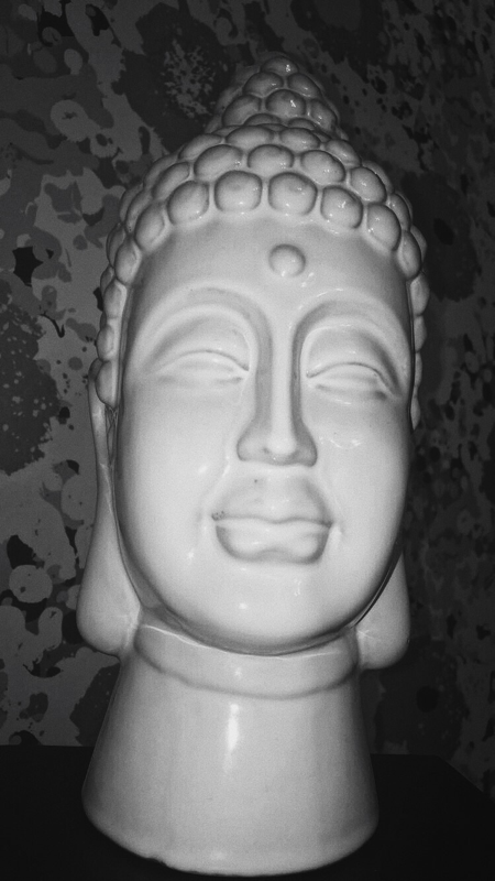
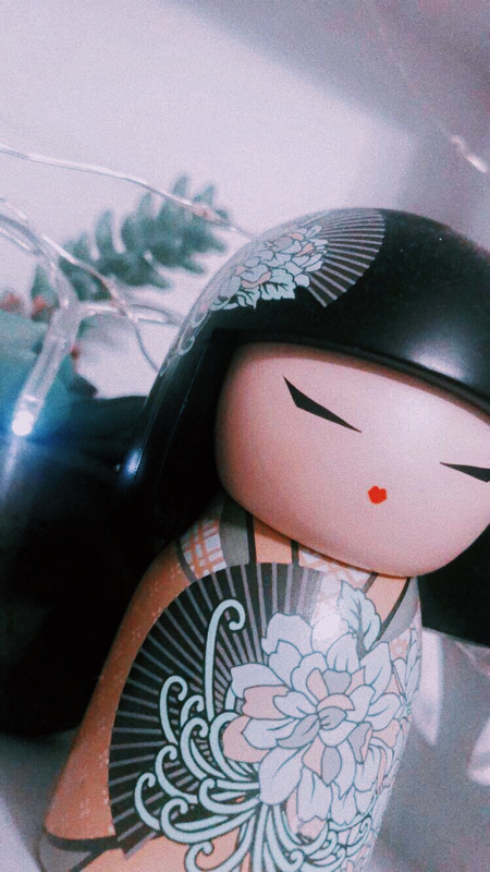
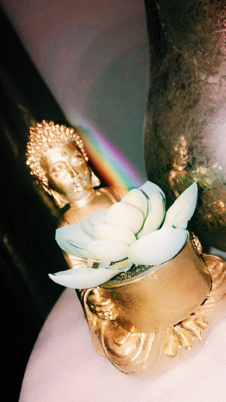
These are my warm-ups for the Moment In Time project. I experimented with different angels, close ups, and lighting. For the first photo I took an up close picture of a Buddha Head in black and white, the assignment was to photograph objects around me. We have Buddhas all over the our house, so I thought it was fitting. The second photo is of a Kimmidoll taken upclose, I have these all around they all represent different things. The Particular one I photographed is called "Sachi" which represents and brings joy. The third photo is of another Buddha taken in my mothers office a rainbow was coming through the window which I thought looked extremely cool, the reflection of the Buddha can also be seen on the side of the lamp, making this photo one of my favorites.
A Moment In Time Photography Project
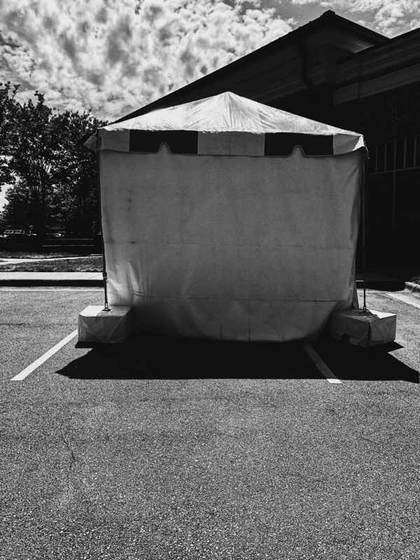
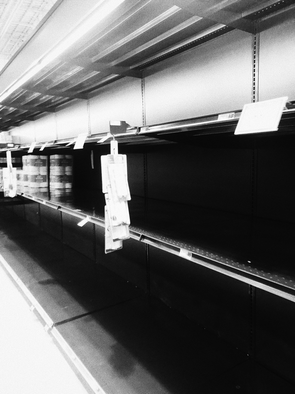
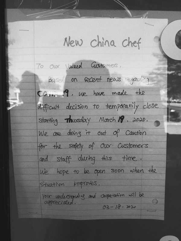
For this project we were assigned to take pictures of things that are representing our quarantine. The first image is of a tent outside for people who are sick so they don't have to go inside the building. This is right near where I live its weird to see while driving past it shows just how scary these times are. The second picture is of an empty toilet paper isle in the grocery store, now its hard to find necessities while shopping and we have to ration our supply. You once were able go to a store and buy what you need, now during these times its becoming more and more difficult to purchase essentials. The last photo is a message from our local Chinese food restaurant saying they will be closing down due to Covid-19. Me and my mother have eaten here two to three times a week for the past 3 years . We run off this Chinese food, and have become close with the owner that she even has our order memorized. It was an extreme adjustment not being able to order food from here, I think I even experienced some what of a withdrawal. However not just us are going through change millions of people all over the world at this time are adapting to the new norm, trying to adjust to new ways of life and routine. These photos show the new adjustments I've experienced and witnessed from new safety adjustments of places of care. Limited quantities in stores, and businesses temporarily closing for the safety of there costumers and workers .
Getty Museum Art Challenge
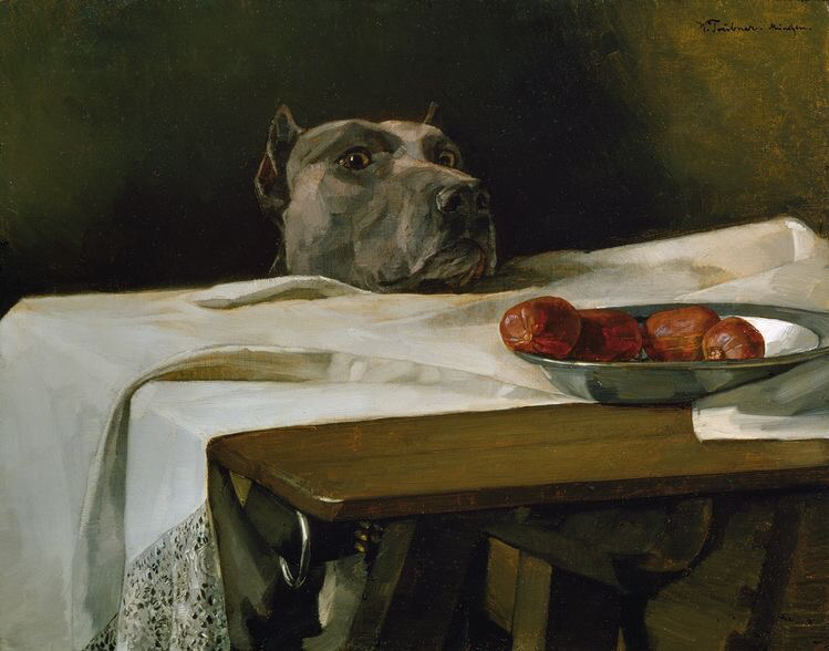
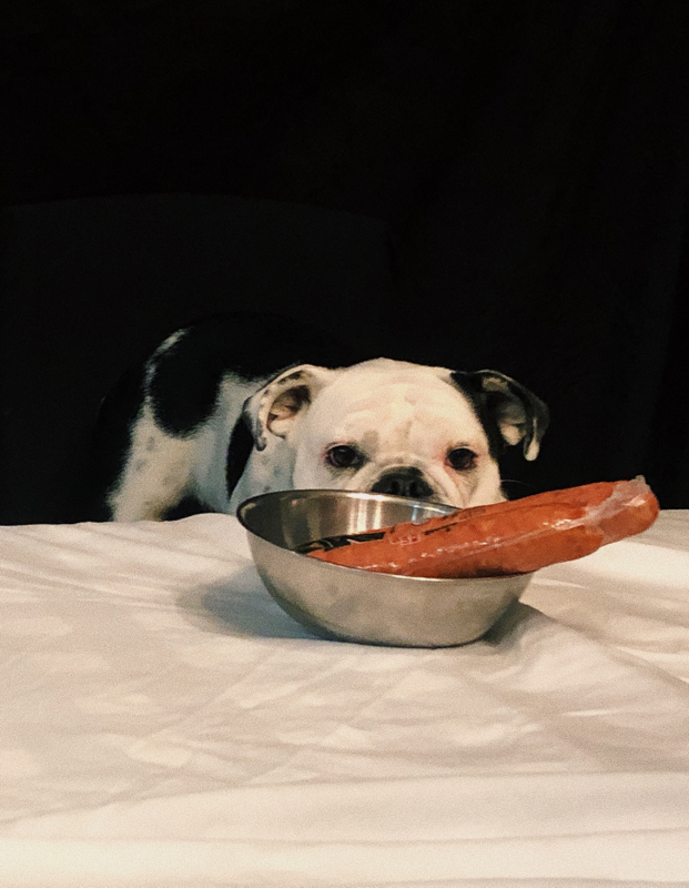
For this project we were required to recreate a famous painting in history with objects we found at home. I decided to do this painting called "Dog With A Plate Of Sausages" also known as "Caesar At The Rubicon" by Wilhelm Trübner . It was painted in 1878. I chose this painting because I really wanted to involve my dog. I bring her practically every where with me, and does basically everything with me so I definitely wanted to recreate something with her. I thought the painting was really cute, I love anything that has to do with dogs, I am a huge dog lover. I used a silver bowl we had in the kitchen to hold the sausage. Then laid out a white sheet and my Aunt held a black sheet behind my dog. I put my dog on a chair and her sit and look at the sausage. The thing off is sausage and dog breed. I left the sausage in its packaging someone who eats meat can enjoy it and it not be wasted, or accidentally eaten by the model. Ivy is a Miniature English Bulldog, while the dog in the painting is a Pitbull. Otherwise I think it looks really similar.
